Designing Cognitive Ease into Data-Dense Dashboards: Best Practices
An in-depth enterprise guide exploring designing cognitive ease into data-dense dashboards. We examine core architectural decisions, data integration pipelines, scaling bottlenecks, and production-grade implementation strategies.
Marcus Wright
Director of Engineering
Introduction: The Strategic Context of Designing Cognitive Ease into Data-Dense Dashboards
Product design is a strategic discipline that directly impacts business outcomes. In a digital-first economy, the usability of a software application determines its adoption rate, customer retention, and overall brand perception. Great design goes beyond visual aesthetics; it focuses on understanding user needs, minimizing cognitive load, and creating intuitive flows that make complex tasks feel effortless. Unfortunately, many organizations treat design as a superficial step in the development process, resulting in visually inconsistent products with disjointed user experiences. True user-centric design requires a collaborative, research-driven methodology. This means integrating designers, developers, and product managers into a shared workflow centered around user feedback and design consistency.
Core Architectural Principles
The foundation of design consistency at scale is a design system. A design system is a collection of reusable components, guided by clear standards, that can be assembled to build any number of applications. By defining tokens for brand colors, typography, spacing, and elevation, organizations ensure that every new page or feature adheres to the same visual guidelines. For design systems to succeed, they must be shared between design tools (like Figma) and frontend codebases. Using Figma variables and token-matching libraries (such as Style Dictionary) allows teams to design variables directly into CSS or Sass stylesheets. This automation eliminates manual alignment errors and speeds up the transition from design mockup to functional frontend code.
Deep Dive Implementation Details
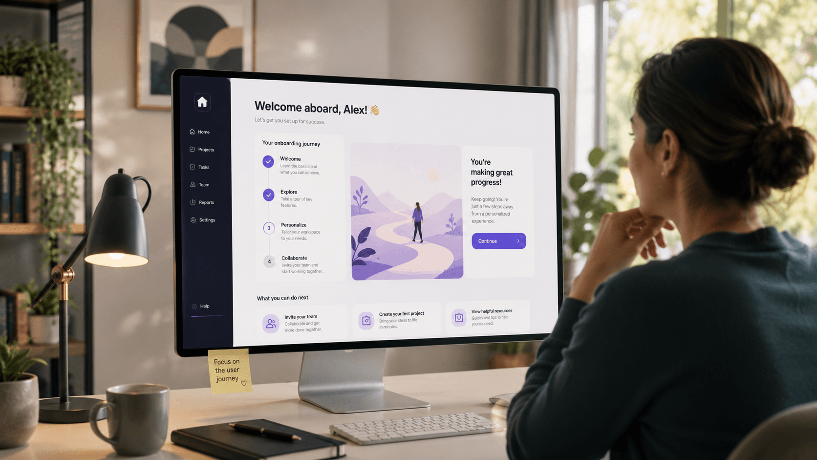
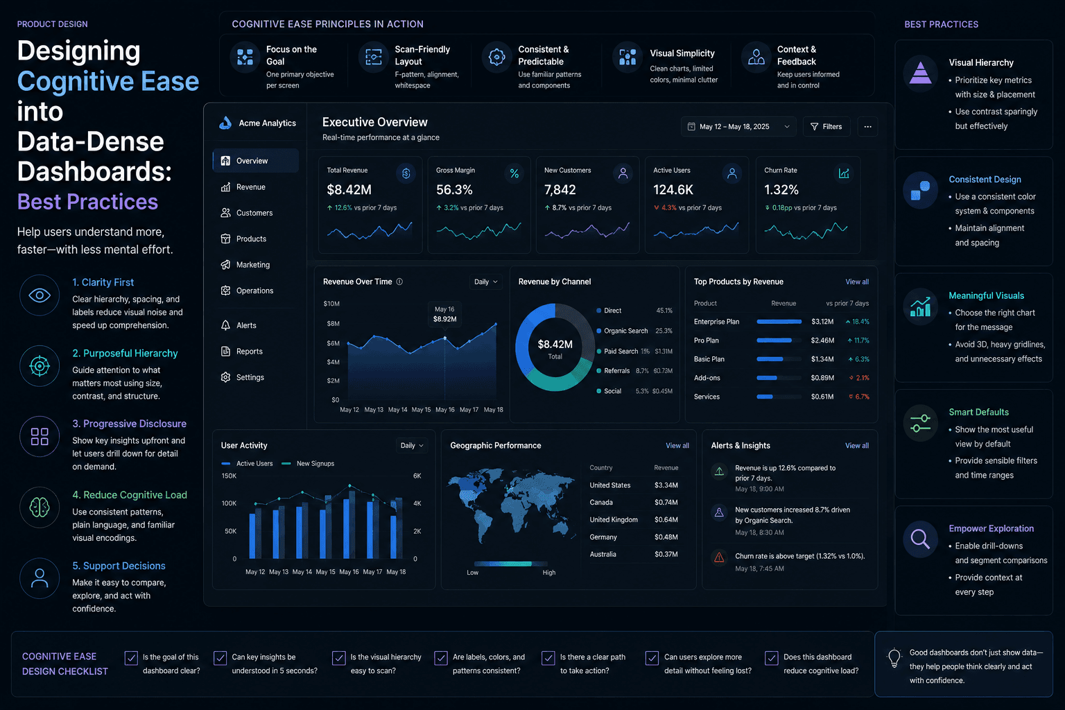
At the user experience layer, managing cognitive load is the primary design goal. Cognitive load refers to the amount of mental effort required to use a digital interface. Designers can minimize this load by establishing a clear visual hierarchy, grouping related items logically, and using standard UI patterns that users are already familiar with, reducing the application's learning curve. Micro-interactions are another subtle but powerful design tool. A micro-interaction is a small visual feedback animation—such as a button hover state, a loading spinner, or a toast notification. These interactions provide immediate feedback, assuring the user that the system is processing their input and guiding them through complex multi-step processes.
Critical Scaling Bottlenecks
A common bottleneck in product design is the gap between design mockups and actual browser rendering. A design that looks perfect in Figma might fall apart when viewed on small mobile screens or when loaded with dynamic user data. Designers must design responsive layouts, test components with varying text lengths, and collaborate closely with developers to ensure the final implementation matches design intent. Another challenge is maintaining layout performance when designing data-dense screens. Dashboards that display real-time tables, graphs, and filter options can quickly become cluttered and slow. Designers must balance data density with visual spacing, utilizing accordion sections, tabs, and pagination to organize information. This keeps layouts clean and prevents users from experiencing choice paralysis.
Security, Trust & Compliance
Design plays a major role in establishing user trust, particularly around data privacy and security. Interfaces should never employ 'dark patterns'—deceptive design practices that trick users into actions they didn't intend to take (such as hidden charges or forced sign-ups). Transparent UI, clear pricing disclosures, and simple privacy settings build trust and user loyalty. Accessibility is another non-negotiable dimension of ethical design. Designing for accessibility means ensuring that users of all abilities can navigate your product. This includes maintaining proper color contrast ratios for readability, supporting keyboard navigation for users who cannot use a mouse, and optimizing layouts for screen readers, conforming to WCAG 2.1 AA guidelines.
Performance Benchmarking & Telemetry
To validate design decisions, teams must conduct regular usability testing. This involves observing real users as they complete specific tasks using design prototypes. Usability testing sessions reveal navigation bottlenecks, confusing terminology, and layout friction, providing designers with qualitative data to iterate on before development begins. In addition to usability testing, teams should analyze quantitative user behavior data using analytics tools (like PostHog or Hotjar). Session recordings, heatmaps, and funnel drop-off reports show where users are getting stuck in the live application. Combining qualitative research with quantitative analytics allows teams to optimize the user journey in a highly data-driven way.
Summary & Operational Takeaways
To summarize, great product design is a continuous loop of empathy, iteration, and collaboration. By building scalable design systems, focusing on visual hierarchy and cognitive ease, prioritizing accessibility and user trust, and validating designs with user testing and data, organizations can deliver digital products that are as functional as they are beautiful.
Written by
Marcus Wright
Director of Engineering
Marcus Wright writes about engineering, design, and AI at Magnence — sharing lessons learned from shipping production systems for clients across 13+ industries.